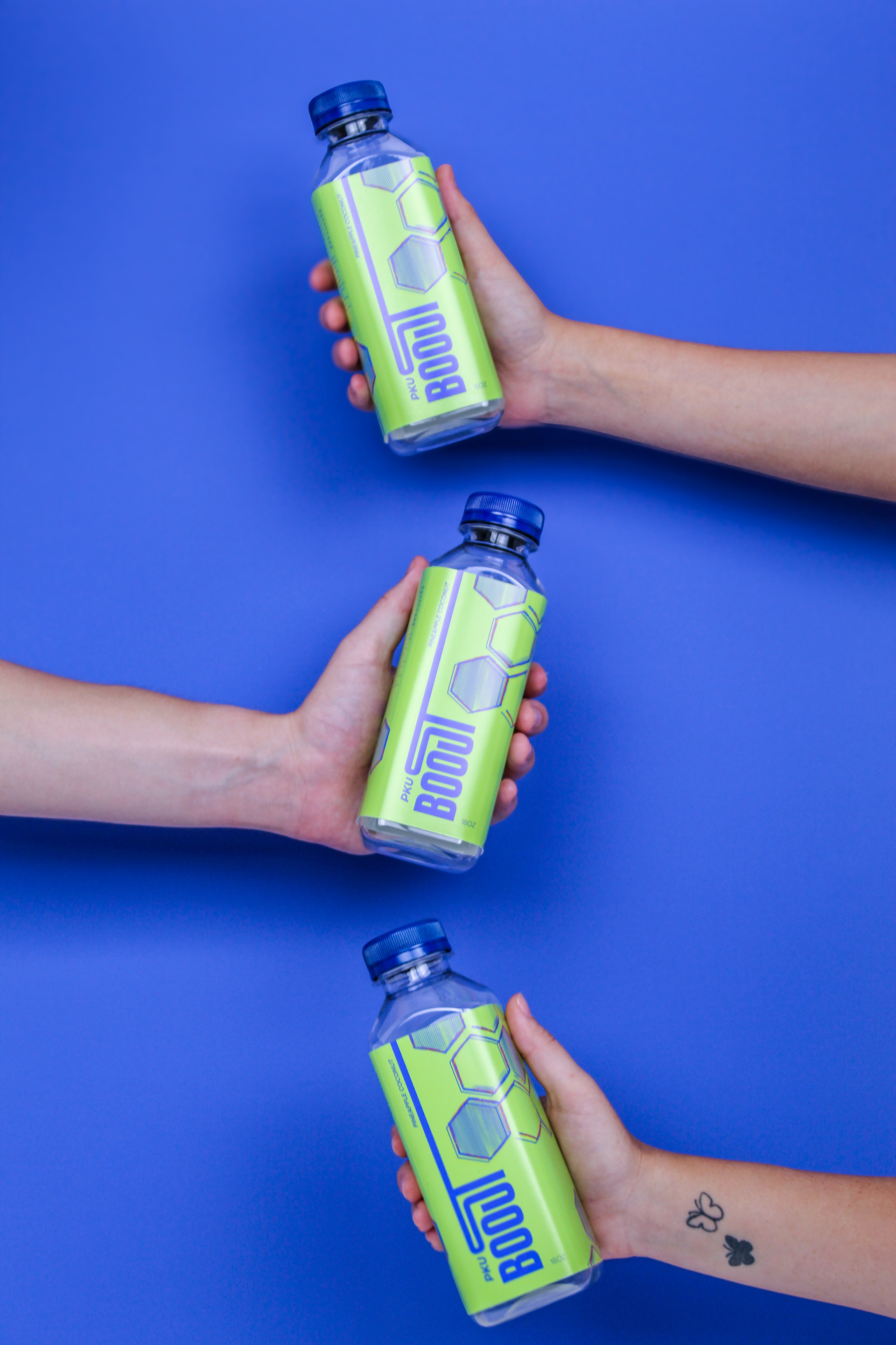
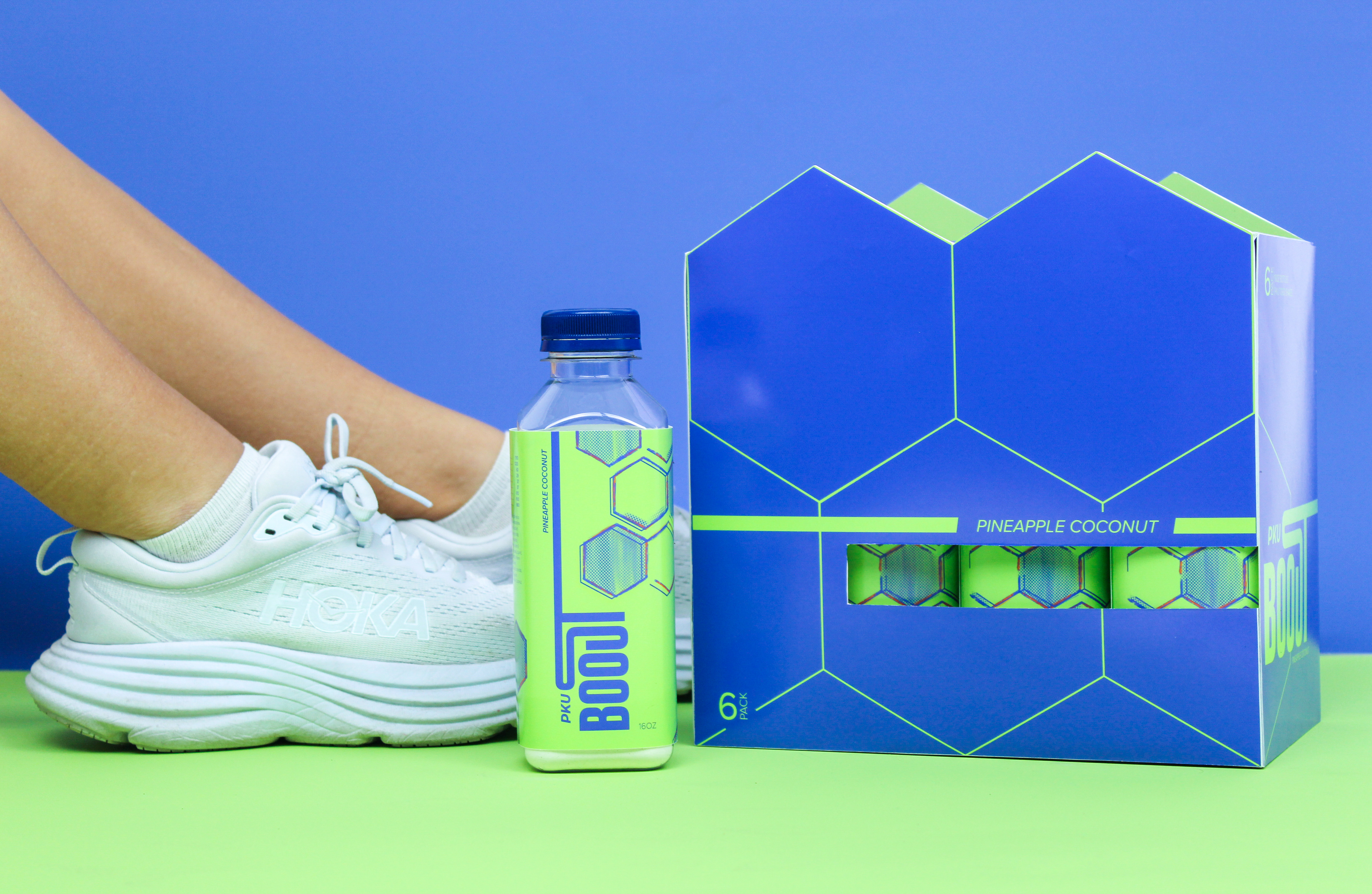
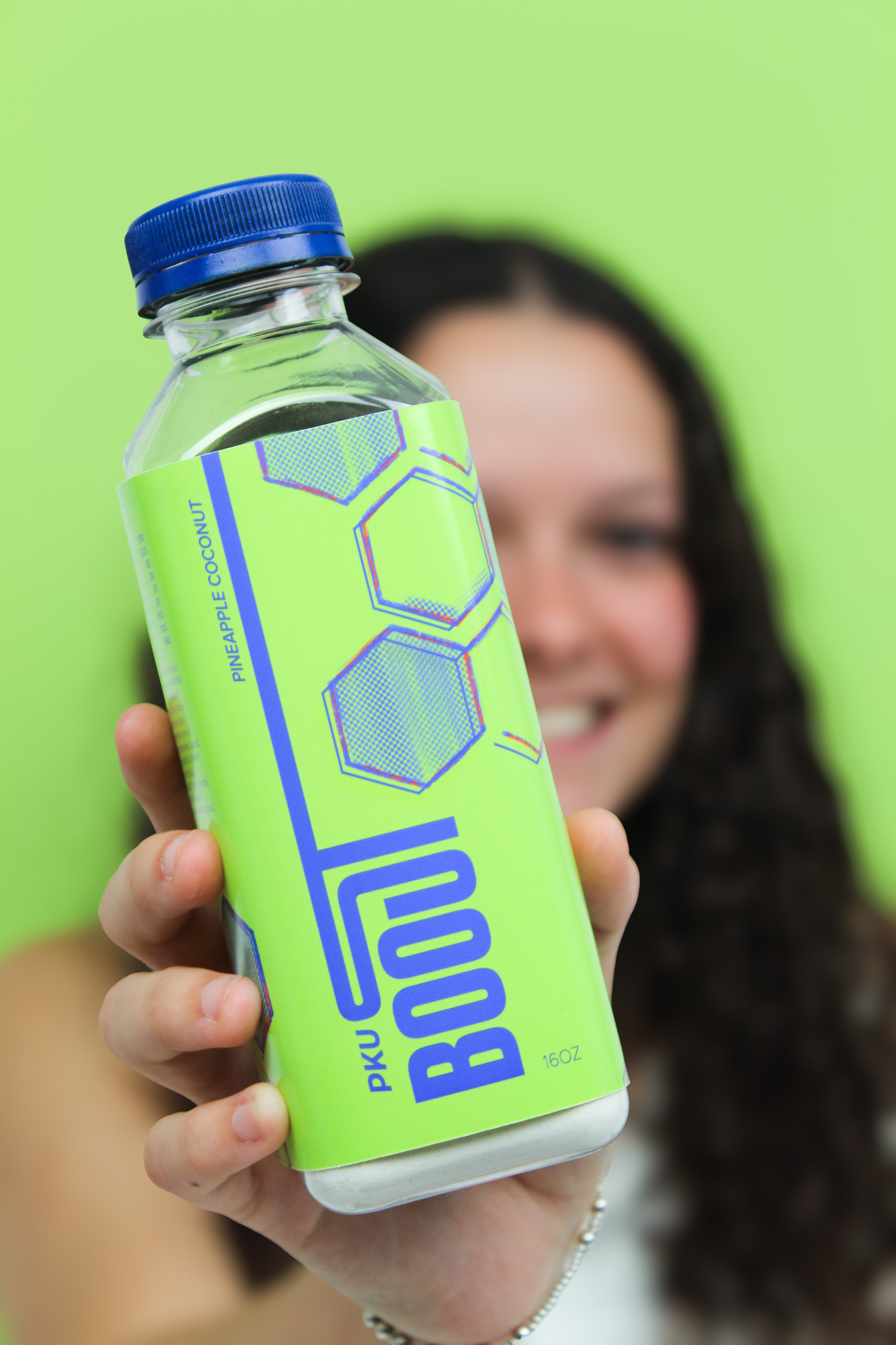
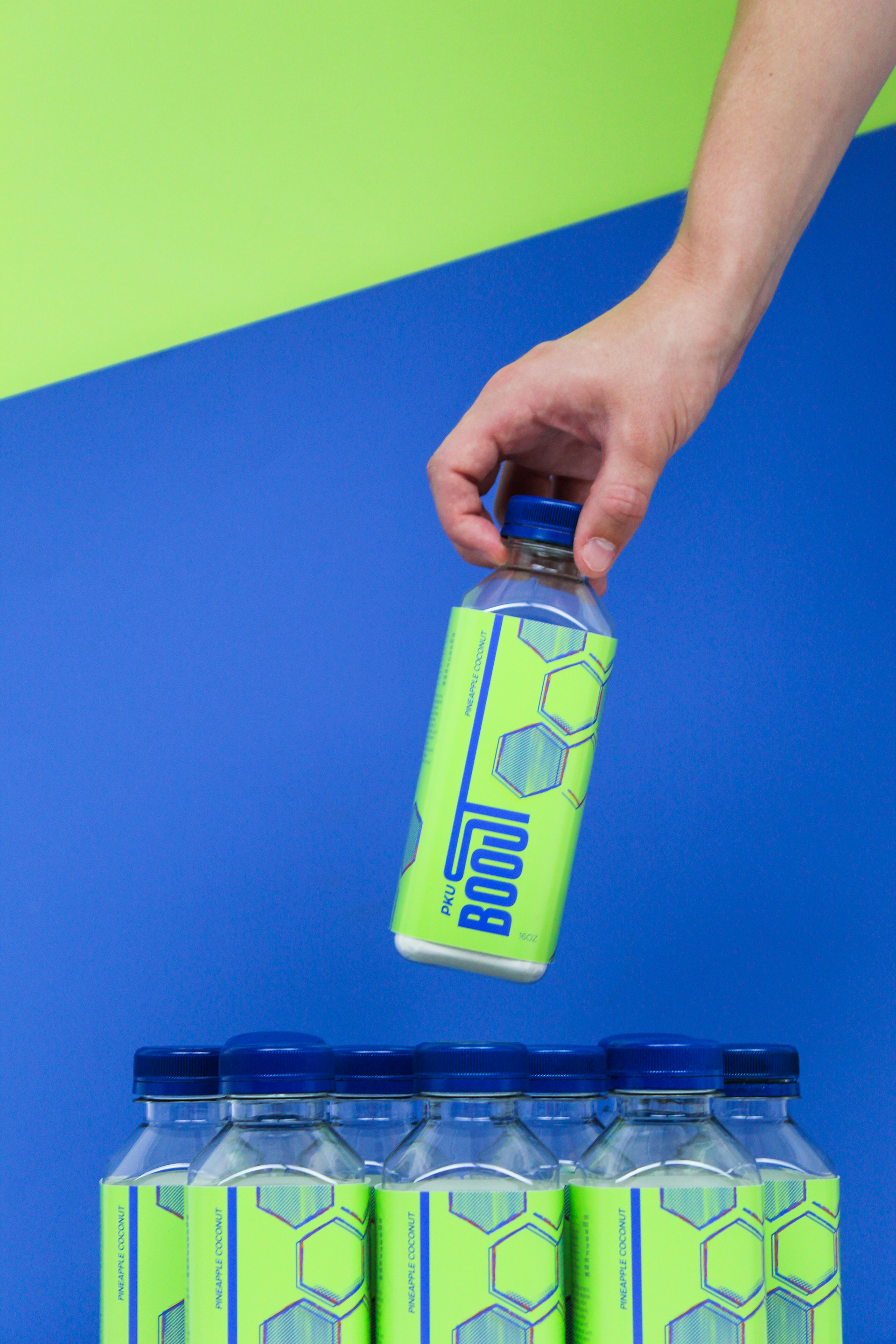
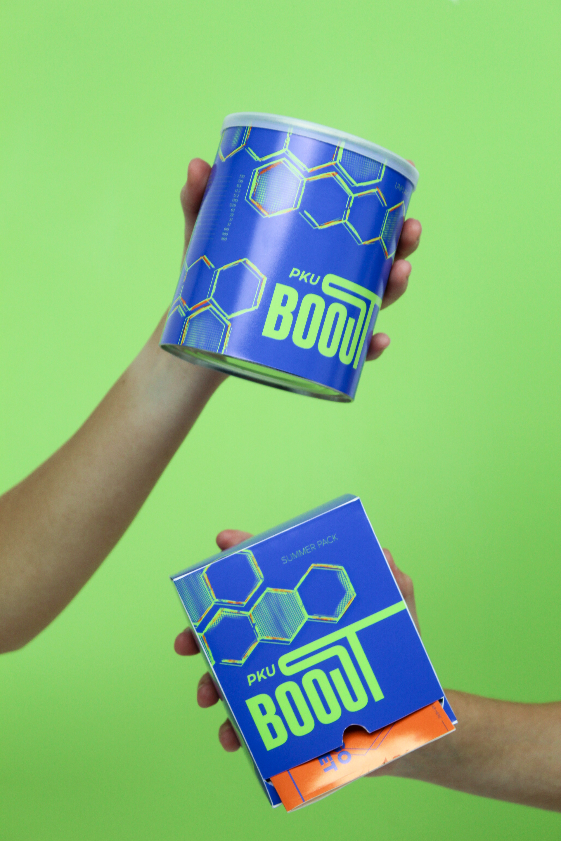
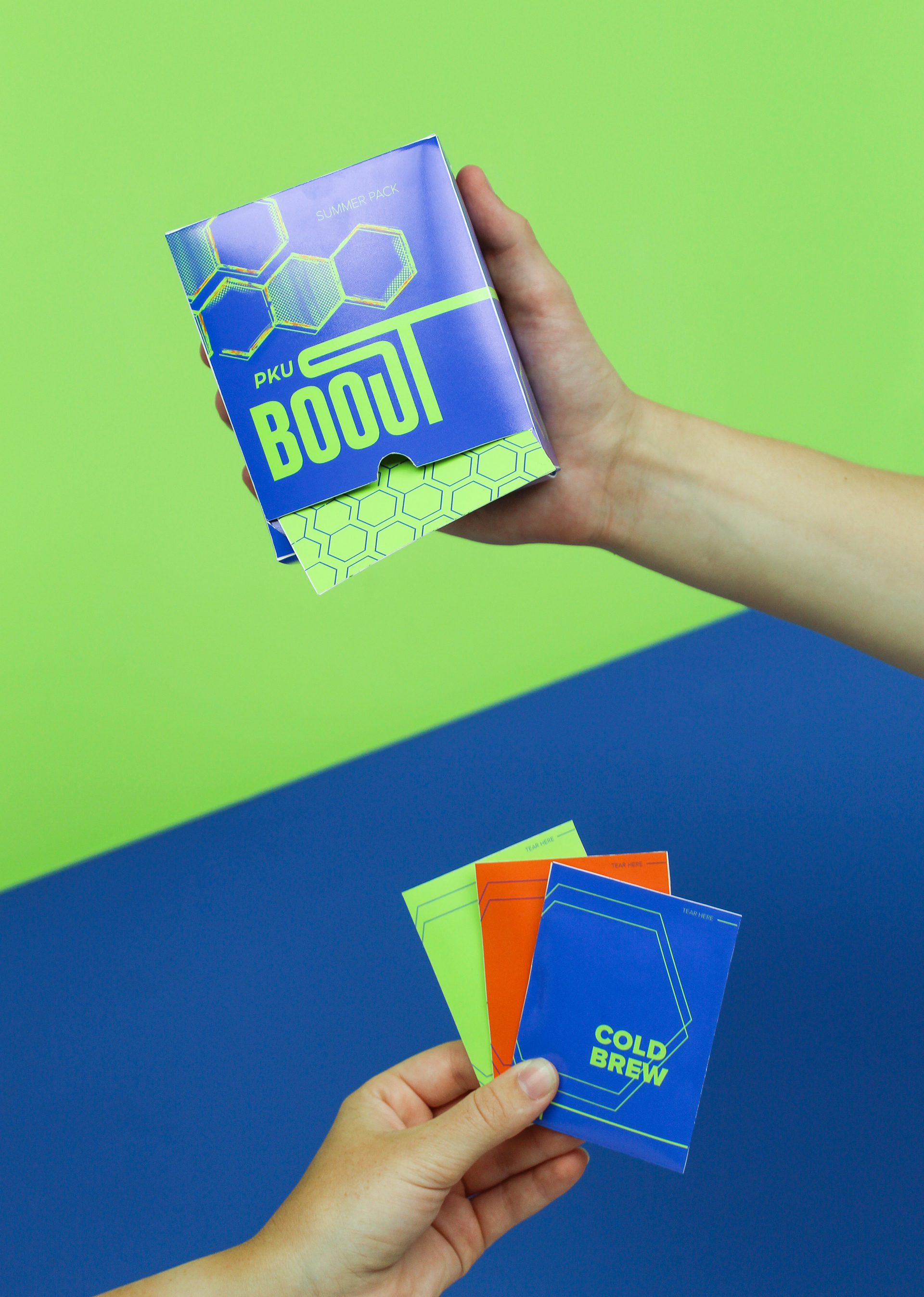

This project is packaging and branding design for PKU energy shakes. The design was inspired to mimic that of an energy drink, making the shakes more socially friendly to take to work or school. The hexagon pattern is derived from the amino acid phenylalanine, which is used to breakdown protein, absent in those with PKU. The colors were chosen to showcase the idea of energy, with a scientific feel. Show below is a 6 pack of grab and go bottles, Seasonal flavor packs, and the medicine unflavored, to add the test packs to.